CASE STUDY
Increasing User Retention Through Gamifying Insurance Quote Process

A complex and long-winded form gets updated with a chatbot functionality and ‘winning’ discounts to keep users engaged and rewarded.

Activities
UI, form heuristic research
Tools
Figma, Google workspace
Project Type
Responsive web form design
Background
Phonexa is a leading platform in the lead generation industry, specializing in providing end-to-end marketing automation for businesses in industries such as insurance, finance, and home services. With a focus on tracking customer acquisition and retention, Phonexa offers innovative marketing tools, including call tracking, email marketing, and an intuitive lead management system.
Along with tracking lead generation, Phonexa also operates several websites to garner leads for their customers in finance, home insurance, and car insurance. This project pertained to one site, InsureYes.com, that targeted consumers seeking multiple car insurance quotes.

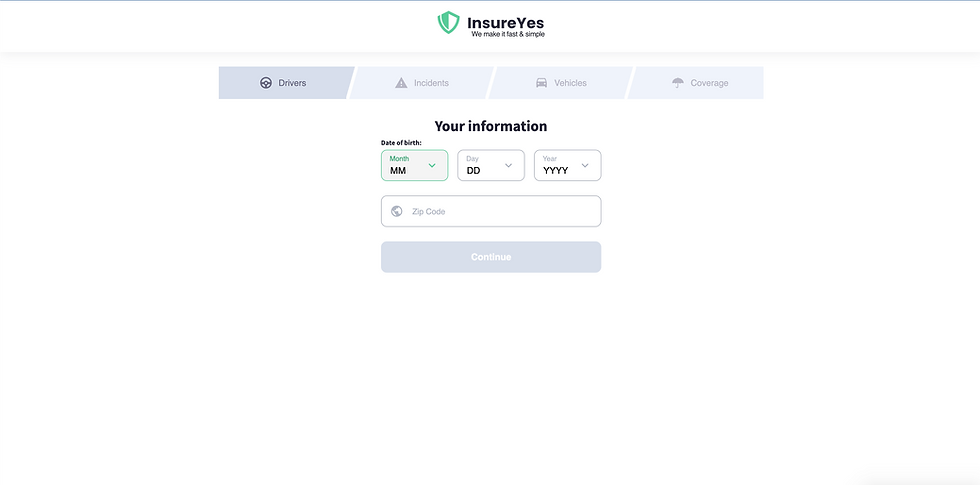
Initial page for InsureYes form
The Problem
The car insurance quote form on InsureYes.com experienced high drop-off rates due to its excessive length and complexity.
Disorganized flow: The non-linear structure made it difficult for users to understand their progress or estimate completion time.
🔄
Low engagement: The form lacked interactive or visually appealing elements, leaving users disengaged.
😴
🚪
High abandonment rates: The mandatory, lengthy set of questions overwhelmed users, leading to significant drop-offs.
Goals
The primary goal of the project was to reduce drop-off rates during the car insurance quote process. Phonexa's business model relied on generating a steady volume of high-quality leads for its car insurance company partners. Since payment from these partners was contingent on delivering completed leads, it was critical to ensure that users completed the form in full.
This project aimed to create a more engaging and seamless user experience to encourage form completion and drive leads.
Process
The process began with thorough research, including an evaluation of the existing form, a competitive and comparative analysis, and a review of best practices for form design from reputable sources like Forms that Work by Caroline Jarrett and Gerry Gaffney and Don’t Make Me Think by Steve Krug. A primary principle from Krug’s book—“It doesn’t matter how many times I have to click, as long as each click is a mindless, unambiguous choice”—directly informed the design, ensuring minimal cognitive load for users.
After discussing approaches with the UX Design Manager, we determined that gamifying the experience and simulating a one-on-one conversation with a personal agent would be the most effective solution. I designed and iterated on wireframes and prototypes, incorporating feedback from the design manager and subject-matter experts. Although usability testing with users was not possible, feedback from experts familiar with the form validated the approach.


Works that informed the UX strategy for this form redesign
Solution
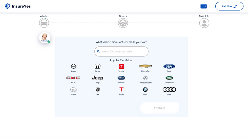
Meet Issy
The form is filled out as if the user was speaking one-on-one to a car insurance agent, which we called Issy.

-
Humanized interaction: Beyond feeling more dynamic and engaging, it simulates a human conversation, making the experience feel more personal and less transactional.
-
One Question at a Time: Issy presents questions to the user sequentially, focusing the user's attention on one question at a time, which simplifies decision-making and reduces overwhelm.
-
Conversational encouragement to complete: Issy cheers on the user throughout the form, with additional conversation bubbles saying things like: “Almost there! Providing this info makes your car insurance quote much more accurate.” or helping the user answer challenging questions, like average annual mileage by saying “The average American drives 14,263 miles/year according to the US Department of Transportation.”
-
Optimized for Small Screens: Chat interfaces are inherently more mobile-friendly, as they minimize scrolling and allow users to respond in a familiar, text-like environment.
Gamified Awards
When form users select options that could earn them savings on their car insurance, colorful animations of fireworks and a coin jumping into a wallet celebrate with the user.
The coin has a number on it, suggesting to the user that there are more savings to unlock as they continue to complete the form.

-
Enhances the value of discounts: Many competitor forms do not notify users that their options might lead to savings. This is a huge missed opportunity to prove value to the user.
-
Dopamine-driven engagement: Instead of feeling like they are filling out a static form, users experience incremental wins along the way.
-
Making the process feel more human: A dynamic, interactive interface with small moments of delight transforms the experience from a chore into something engaging, similar to how apps use progress badges or milestone celebrations.
Overall Form Progression

-
Too personal too soon: The first questions in the form pertain to personal information about the user, which can cause users to feel uneasy and mistrusting. Moreover, it signals that the form is focused on data collection rather than helping the user.
Overwhelming Layout: The old form presents multiple questions at once, which can overwhelm users and increase cognitive load.
Lack of Guidance: The indicator of where users are in the process is far too subtle (light grey/dark grey), creating uncertainty and frustration about the progress.
Low Engagement: The design lacks interactive or visually appealing elements to keep users motivated to complete the form.
Outcomes
Although the project was not implemented during my time at Phonexa, the proposed solution received positive feedback from internal stakeholders and subject-matter experts. The innovative use of gamification and conversational elements was anticipated to significantly improve user engagement and form completion rates.
Ideally, the next step would involve testing the design with users to validate its effectiveness and iterating based on their feedback. Metrics such as site traffic and drop-off rates would provide a clear picture of its impact before final implementation.
If successful, the redesigned form would not only improve user retention but also drive increased traffic to Phonexa’s car insurance partners, enhancing their satisfaction and solidifying partnerships. Furthermore, the improvements could position Phonexa as a more attractive platform for additional businesses, paving the way for future growth and collaboration opportunities.